
For instance a straight gray ramp looks quite non-centered when drawn in linear floating point:
The same ramp drawn directly in sRGB output pixels produces what most people expect:

Fortunately you can easily get quite close to the sRGB output by simply squaring the values before using in a linear representation. This makes it relatively easy to modify an existing algorithms to produce similar output in linear floating point without changing their speed much. Here is the ramp squared (so the .5 in the middle turned into .25) in linear floating point:
A problem I have not solved is when both the true linear and the perceptual data is needed. This seems to be a problem with line art graphics. The left column is some text and and graphics drawn in linear floating point, and the right is the same graphics drawn in sRGB. The bottom row is exaclty the inverse of the top row:


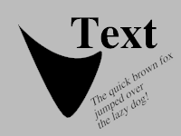
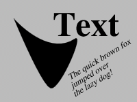
The linear image produces better antialiasing. But it looks like the sRGB version produces the correct inverted image. In fact mathematically the linear inverted image is correct, but your mind apparently inverts things in perceptually-uniform space, making the sRGB look like the correct inverse. I am not sure if there is a way to get both nice antialiasing and get the expected inverted image.